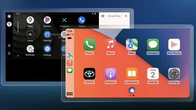
The latest Toyota Tundra has new grilles, new design, new payload ratings and even a new hybrid drivetrain. It also has a new interior, which features one of the biggest upgrades in a recent Toyota vehicle. The new Tundra will be the first Toyota model to get the reworked infotainment system the carmaker developed for its next-generation cars.
This system debuted on the Lexus NX, and is Toyota’s bid to outdo Apple and Google inside your car. The carmaker invested a lot of time and money into supplanting the PC in your pocket while you’re driving. Call me a skeptic, but I’m unsure it’s going to work because even in their cars, people love to use their phones.
(Full Disclaimer: Toyota invited me to the full unveiling of its latest Tundra near its headquarters in Plano, Texas. The company flew me out, put me up in a nice hotel and fed me, too. I got a chance to actually use Toyota’s newest infotainment system.)
The new infotainment system is called the Lexus Interface in the Lexus NX, but it’s called the Audio Multimedia system in the Toyota Tundra, and it really is one of the biggest changes in the Tundra. The infotainment lives inside of a massive 14" screen. Seriously, the screen is bigger than the screen in the forthcoming Hummer EV.
There is an eight inch screen, which is standard on base models, but once you go up to higher trims like the Platinum, 1794 or TRD Pro, you get the big screen.
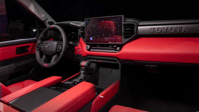
To the Toyota’s credit, even though the screen is bigger than the Hummer EV’s, it doesn’t break up the interior in the same way. And that’s by design. Toyota claims a lot of current trucks (and cars) have a vertical center stack. This divides the interior, with the infotainment breaking it right down the middle.
So, Toyota went with a horizontal, rather than vertical design. In the Tundra, you read the center console from left to right rather than top to bottom. The A/C vents attach to the screen, so it looks more integrated rather than just floating there, out of place.
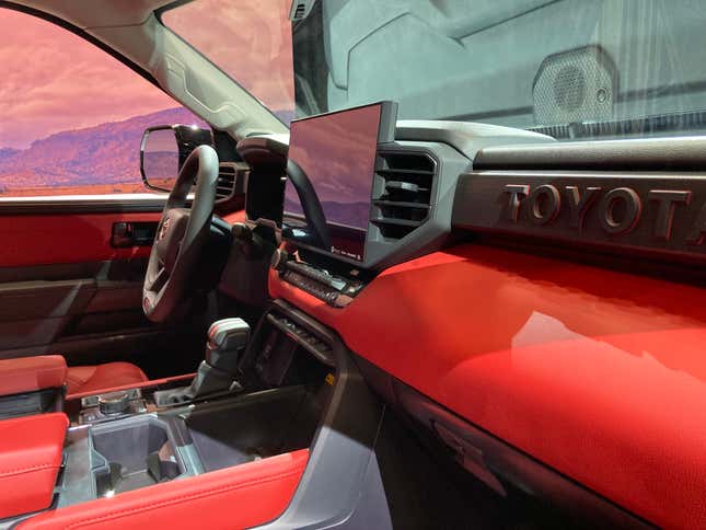
There’s a panel beneath it for HVAC controls and for the big volume knob. Right below that, you’ll find the gear shifter and the mode selector knob, along with a switch to toggle two- and four-wheel drive. There are also an assortment of controls nearby, buttons for the parking brake, hazard lights, and a big wireless (Qi) charging pad. There’s space for another phone, but no wireless charging there. Apple CarPlay and Android Auto are wireless, too.
The charging pad is a slanted up instead of laying flat, so drivers can keep an eye on their phones. I’d prefer if this space had a cover, because if it did, it might help put my phone out of mind.
That console extends into the armrest and then to cupholders for the backseat, whose passengers get a cavernous compartment.
Which brings me the point about this truck being the first Toyota to borrow a Lexus interface. It could just be production schedules, but there’s something to a utility vehicle, a pickup truck, being the first to get an interface designed for luxury cars.
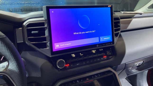
So how is the interface? It’s great — when it works. The new system is partially cloud-based so cell service is kind of important, and the truck’s Data Communication Module relies on AT&T’s mobile network. The Comerica Center where the Tundra was shown had spotty reception. This made testing features frustrating. Toyota says that some of these can be cached, and that the system is smart enough to pre-load maps if the truck is getting close to an area with bad reception. I hope that’s true, but I would hate to test that on unfamiliar roads.
Ditto the “virtual Intelligent Assistant.” That’s Toyota’s version of Siri or the Google Assistant, which you summon using one of four voice prompts that are basically just “Hey, Toyota.” It can do pretty neat things, like handle HVAC controls, music volume, and the windshield wipers. These basic commands are not cloud-based, so they’re usable regardless of reception.
At speeds over five miles per hour, the voice assistant will handle your searches for things like navigation, or weather or points of interest. Those come from Google Maps, and everything about the system can be updated over-the-air.
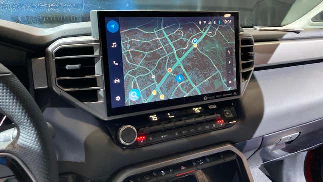
The interface reminds me of a modern Linux distribution, with an eye for user-friendliness. Like if someone put Ubuntu through a Toyota filter. Which is to say, I think the interface is good. There are user profiles that can be assigned to different key fobs, and there’s a smartphone app for settings and to save a work or home address. Anything you save is encrypted, according to Toyota. That means law enforcement officers can’t access your data, unless you provide the encryption keys. Toyota assured me there are no backdoors. We’ll see.
The interface has a tab on the left with icons for navigation, music, your phone, car settings and system settings. Music streaming is flexible. The system will connect to Apple Music, Amazon Music, Spotify and who ever else partners with Toyota. Meaning it’s not locked in to a specific service.
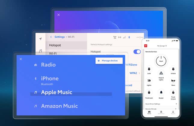
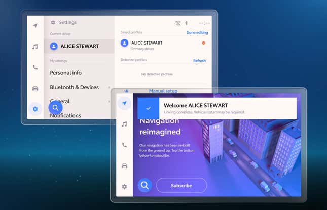
The parts of the interface that I did get to use, like music streaming, navigation and system settings were intuitive and mostly OK. It was not any better than using those applications on my phone, but it wasn’t any worse either. The thing is, CarPlay and Android Auto are right there. They are so easy to access. I was actually confused when I wanted to go from the native nav screen back to Apple Music. Was I supposed to go through CarPlay? Or through the Toyota system?
I’m sure it takes getting used to, but I had to take a beat and remember to not use CarPlay. That’s what I’m concerned about here. Even if Toyota has the chops to compete with Apple and Google from a tech standpoint, this system lacks the familiarity people have with those platforms.
Telling people to ditch those is a heavy lift. I’m all for making it easy for people to ditch their phones, especially on the road. For certain drivers, this system might finally be the answer to not having to fuss with a smartphone, and that’s fantastic! For many drivers, though, the Toyota Audio Multimedia System might be an afterthought.
