I know we’ve been doing a lot about the new mail delivery vehicle, but think about it — this is, more than most new car introductions, a vehicle that all of us Americans (global friends, please feel free to weigh in) in some sense, own. And even though the Postal Service doesn’t actually use our taxes to buy these, they still do a job for us, and we encounter them nearly every day. It’s our new mail truck, so I think it’s worth really exploring.
This is a machine designed to perform a very specific job, and the design absolutely reflects that. Off-the-shelf delivery vans don’t really cut it. I spoke at length with my own mail carrier about the interim RHD Mercedes Metris vans they were using, and even with those being more comfortable than the old LLVs, he was not happy with them.
They were too hard to load and unload, the wrong height to get access to mailboxes, and just not laid out in a way that a mail carrier finds useful. This is a reasonable place for a bespoke design, and I’m glad to see the post office is continuing with that path.
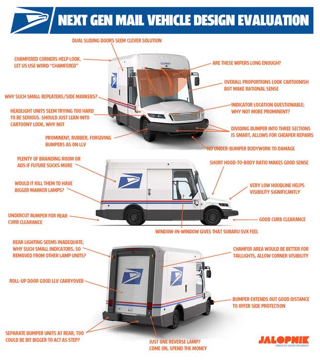
The Oshkosh Next Generation Delivery Vehicle (NGDV) selected is an overall good design, I think; sure, it looks kind of cartoonish in its proportions, but if you think about the design decisions that led to that, it’s understandable.
This is a vehicle that needs maximum interior volume, excellent visibility, the ability for workers to stand up inside while moving and sorting packages and so on — it has to be tall.
The low, stumpy hood makes sense to take up less valuable exterior real estate and to keep short items directly in front of the grille — where kids and dogs might lurk — in full view.
The large rubber bumpers are forgiving and durable-looking, and are divided into thirds. In the event of a small wreck, the whole thing won’t necessarily need to be replaced.
There are a lot of good decisions here — and some questionable ones. Mostly, I find the lighting design poor. Part of it is that I would have gone with friendlier, round headlights to really lean into the cartoonish look, but more important, all the lights seem too small and placed in ill-chosen locations.
Why are the front indicators narrow things in the grille, near the vehicle’s centerline? They should be prominent and at the corners, easily visible from any angle. Maybe on the A-pillars?
Marker lamps are tiny, as are the taillight units, which should also be on those chamfered corners, for better angle visibility. And why just one reverse lamp? Drivers need to see behind them well when backing up. Spend the damn money already and give them two reverse lamps.
Anyway, you can see all my thoughts here:

Mail trucks are part of an America’s visual landscape, and this one will be part of that landscape for decades. It’s worth really thinking about how they’re designed, because we have to live with them.
The good news is I think this Oshkosh design is a very solid basic foundation; it won’t take much to make it even better. Oshkosh is of course free to reach out to me for input.
We still know very little about the underlying tech, but we’re looking into that and will cover it next! Well, as soon as we can get Oshkosh to talk to us about it, I mean.