Ever since Hyundai-Kia snagged Peter Schreyer (who was one of the designers of the Audi TT, among other things) from VW/Audi back in 2006, the design of the cars built by the two companies, Kia especially, I think, have improved dramatically. Today’s announcement of a new design philosophy is the first major change since Schreyer’s “Tiger Nose” look that has defined the cars for the past decade or so. Kia calls it “Opposites United,” and has all kinds of goofy PR-talk about it. But that doesn’t matter much, because, as we see it on the new EV6, it looks very good.
This new design direction was headed by Karim Habib, head of Kia’s Global Design Center.
The new design look is very clean and modern, and a pretty significant departure from Kia’s previous look, especially the front end, which drops Kia’s signature grille in favor of a face that sure looks a lot like Volkswagen’s electric ID-series front end. Here, look:
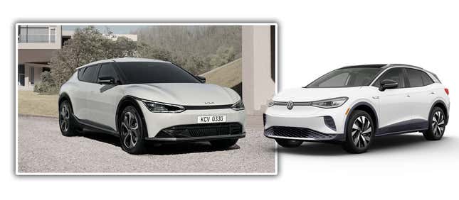
The shape of the main light units, that thin not-grille dark band connecting the headlights — it’s a pretty similar face. Kia is calling this the car’s “Digital Tiger Face” which kind of sounds like some awful grimace a misguided modern self-help jackass would tell you to do in the mirror every morning in their book, Becoming Your Own Digital Tiger.
I’m not saying there’s anything wrong with the look, but it’s hard not to point out the similarities there.
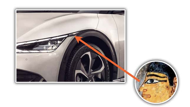
That said, I think the rest of the Kia look is cleaner and a good bit more cohesive than what I’ve seen of VW’s ID look, at least as we saw on the ID.4. Kia is paying close attention to details and has come up with some nice solutions, such as how the front side marker lamp forms an interesting little band from the corner of the headlamp unit to the front wheelarch, like ancient Egyptian eye makeup:
Also noteworthy are the blacked-out A-pillars, which help give the windows (I know car designers call them DLOs for “daylight opening,” but I just can’t with that) a wraparound look that reminds me a bit of the Lancia Stratos HF prototype:
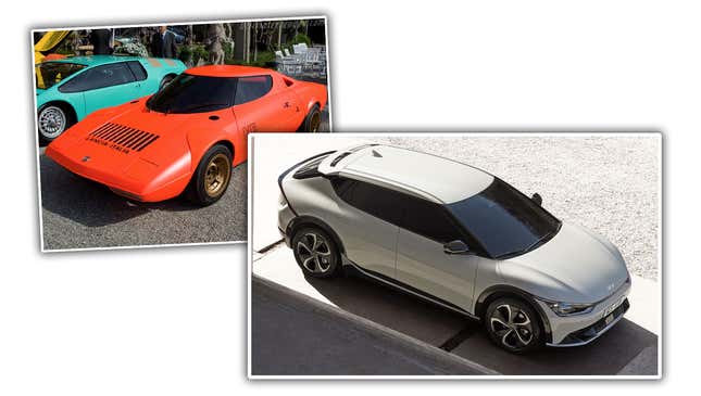
I know it’s hardly the first car to do this, but blacking out the A-pillar isn’t nearly as common as blacking out the B-pillar, and really gives the cabin a fun-looking wraparound, unbroken window band effect.
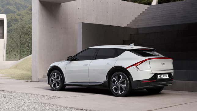
The rear lighting is quite dramatic; we have a full-width taillight band, something that seems to be becoming more and more popular, with a dramatic downward swoop at either end.
This is a tricky choice, as it could become a huge red frown, but in the case of the EV6, it follows the spoiler lip and overall pinch of the rear design, hugging the break between the slope of the hatch at the rear where it transitions to a more vertical drop.
The rear marker lamp is also very elegantly integrated into the whole of the rear lighting design — Kia has been a pioneer in good marker lamp design for quite some time — and the whole band is balanced by a lower band of brightwork, with some patterning where it kicks up to meet the rear lights at either side.
It’s also interesting to look at the rear as a sort of inversion of how car butts are normally designed, with the two blank panels on either side of the tailgate being the normal location for taillights. Look:
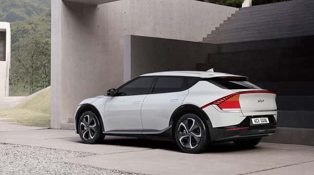
See what I mean?
Do you want to hear how Kia’s PR team describes the new “Opposites United” design philosophy? Of course you don’t, nobody does. But I have to read it, so maybe you need to share some of this pain, too:
EV6 was designed under the brand’s new design philosophy ‘Opposites United’, which takes inspiration from the contrasts found in nature and humanity. At the center of the design philosophy is a new visual identity evoking positive forces and natural energy, with contrasting combinations of sharp stylistic elements and sculptural shapes.
Okay, that’s not too bad, really. I’ve read worse.
The philosophy is based on five key design pillars: ‘Bold for Nature’, ‘Joy for Reason’, ‘Power to Progress’, ‘Technology for Life’, and ‘Tension for Serenity’.
Bold for Nature is based on interaction with nature, informed by the details, shapes and proportions found both in the natural and human worlds. This design pillar creates organic, yet technical structures and finishes for vehicle interiors; exterior designs are characterized by a combination of clear and simple lines with bold, ever-changing surfaces.
Joy for Reason focuses on the feel and ambience of Kia’s future vehicles. Future designs will fuse the emotional with the rational, creating vehicles that influence the mood of passengers, by relaxing and inspiring. It will also influence the adoption of new organic materials and more daring colors, expressing a sense of youth and playfulness.
Power to Progress builds on the brand’s current design strengths. By drawing on and developing the skills and expertise learned throughout Kia’s recent era of design-led transformation, the designs and layouts of the brand’s future products will continue to evolve. Future designs will draw on experience and creativity to invent and innovate new designs.
Technology for Life embraces new technologies and innovations to foster positive interactions between humans and machines. The brand’s future vehicles will adopt a next-generation in-car user experience (UX) through design and innovation and advancements in lighting, feel and in-car connectivity – to help customers engage with their cars.
Tension for Serenity evokes the tension between opposing forces and creative contrasts, and recognizes the design equilibrium that comes from two opposing forces. It delivers striking design concepts that use sharp, highly technical details to create surface tension – and realize a harmonized, future-oriented design vision.
Yes, yes, Tension for Serenity. Power to Progress. Live, laugh, love. Joy for Reason. Day for Night. Bold for Nature. Hot for Teacher. And when there was only one set of footprints? Well, friends, that’s when I was carrying you.
Hey, now you have to watch this video about it! If you turn off the sound, it’s not bad at all:
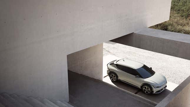
Dopey PR-talk aside, I think Kia is onto something really strong here. This is a clean, striking design direction that, at least in the first real form we’ve seen it, this EV6, works very well.
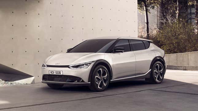
The proportions feel balanced and practical, and they’re doing a lot with the contrast of the body color to strategically blacked-out areas: the A-pillar, the black wheel arches to give the illusion of larger wheels, the little bar on the C-pillar to make the floating roof, that strip at the base of the doors that gives a slight tightening of the waist and a kick-up at the rear. There’s a lot of patterning going on here.
It all makes me wonder if this design will suffer with dark colors? Will you lose all of these crucial details if the car is black? Let’s see:
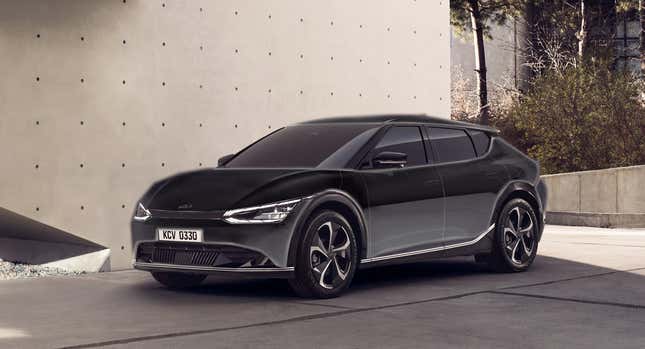
Hmmm. Yeah, you kinda do. It kinda becomes a blob.
The interior design appears to attempt to avoid trends towards abject minimalism, and incorporates a lot of varied textures:
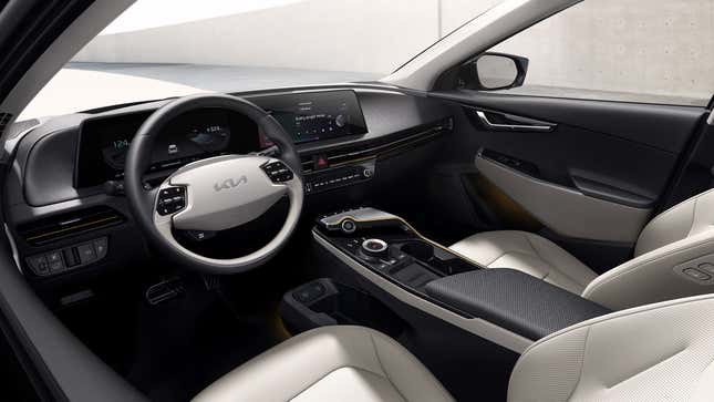
This feels less radical than the exterior, but seems comfortable in a familiar way, and I do like the textures used.
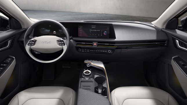
The center stack display seems to be unified with the instrument cluster, which looks clean, though the yellow-and-black hash lines under the HVAC vents feel like caution tape, to me.
Overall, I like Kia’s new design direction, and out of most carmakers recently, I think they’ve proven that they know how to take a design theme and really run with it to make some powerful car designs. I’m excited to see what comes next.