This week has seen a lot of surprisingly intense discussion about yoke steering wheels, mostly thanks to Tesla’s use of them on the refreshed Model S, and along with the yoke wheel design came Tesla’s stalk-less turn indicator controls, which I’ve mentioned before. I came down hard on the stalkless indicator controls, which got me thinking about the turn signal stalk itself, and wondering if it really is the best way to indicate turns. So, let’s dig into this, and look at some of the other ways carmakers have tried to let us turn on blinkers.
Conceptually, turn signals present an interesting problem to car-human interface designers. You might think that in an ideal method of handling them might sort of fit in with Elon Musk’s “input is error” philosophy, which takes the approach that if an machine can anticipate a user’s needs, that’s better than requiring them to actually input to tell the machine what they want.
I have my own issues with this approach, but it’s easy to imagine that maybe automatic turn signals could make sense, automatically activating when the wheel gets turned. Hell, this wouldn’t even be difficult to do — a simple mercury tilt-switch could accomplish it!
But even a tiny bit of thought reveals the problem here: turn signals are anticipatory, in that they’re activated before the action has been taken. To make them automatic, the car would have to be able to predict the desired near-future actions of the driver, and that’s still something beyond non-magic technology.
Plus, there’s plenty of times you’ll want to turn your wheel without indicating a turn. Or indicate when you’re not turning at all. Turn signals are communication devices, fundamentally, and as such work best when the person communicating decides to use them.
Okay, so let’s look at the conventional turn indicator stalk, and let me explain to you why I’ve come to realize what an elegant and wonderful solution it really is.
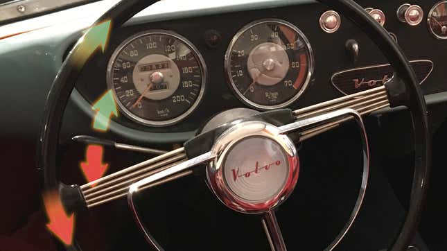
I can’t imagine anyone isn’t familiar with it, but the standard type of turn indicator control is a stalk, mounted on the steering column, that one pushes up to indicate a right turn, down for left.
The up-is-right, down-is-left thing sounds counterintuitive at first, until you actually use it and realize that it’s all about following the flow of your hands on the wheel: clockwise for right, counterclockwise for left.
Indicating a turn with a stalk is a natural, easy, even elegant action: you simply flick the switch in the direction your hand is already preparing to travel. It’s completely intuitive in use and becomes a muscle memory without even trying.
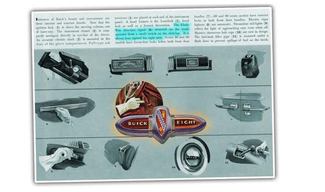
The very first flashing turn indicators didn’t use the stalk method, instead relying on a little switch, which was itself mounted on the shifter. I haven’t been able to find conclusively who was first to introduce the stalk as we know it, but I’m looking.
There’s been many attempts to find other ways to indicate a turn, so let’s go through some of these now and see if any of them actually manage to improve on the stalk we all know.
Steering-wheel-mounted capacitive-touch buttons
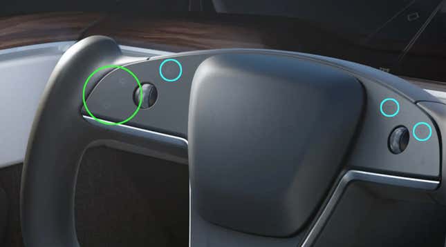
Tesla uses these flat buttons (circled in green) on their yoke. They maintain the up=right, down=left standard of the stalk, but unlike a stalk they require precise positioning of the thumb, and since they’re flat and non-tactile, you’ll have to look to be sure you’re hitting them, at least sometimes.
Are they better than the stalk?
Uh, no, at least not in any way I can see, beyond just not liking stalks, for some reason.
Steering-wheel-mounted mechanical buttons
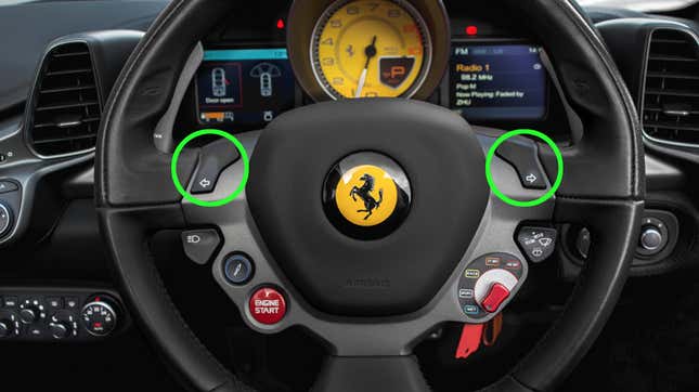
I think the Ferrari 458 is the best-known user of this method, which uses a very straightforward left-and-right location of the buttons, which are thumb-accessible.
Are they better than the stalk?
I imagine you can get used to this fairly quickly, though I don’t really see a huge advantage here. Since Ferrari seems pretty committed to cramming as many controls as possible on the steering wheel, I suppose they make sense in this context, but since the normal use of a stalk never really requires you to actually take your hands off the wheel, I can’t see the big advantage here.
Maybe if you have a real death grip on the wheel, these are better? But that’s not a great way to drive.
Dash-mounted switch
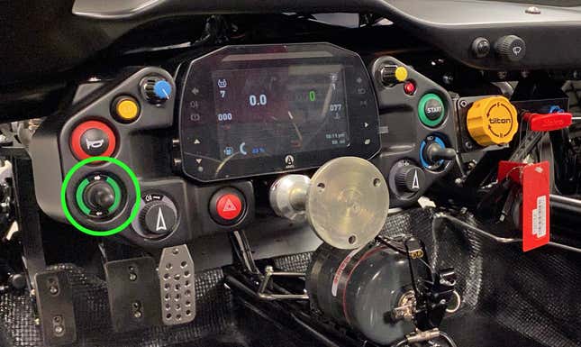
I’ve been in a few older cars that have long dash-mounted stalks that move right and left to indicate turns, but the most recent car I drove with this setup was the Ariel Atom, a very track-focused car.
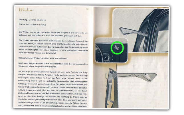
A number of old cars with trafficators (you know, those funny little sempahore arms) used these, and on those the dash switch has a bit of old-school charm, like on this very early Beetle:
Is this better than the stalk?
Uh, no. It’s not better. Not at all, really. On the Atom they’re good enough, since it’s not really the kind of car that is used in contexts where indicating turns is a big deal. In practice, the left/right dash switch is clunky, requires taking your hand off the wheel, and just doesn’t give any benefit beyond the weird urge to stalklessness.
Rotating Horn Ring (and other steering wheel hub-mounted switches)
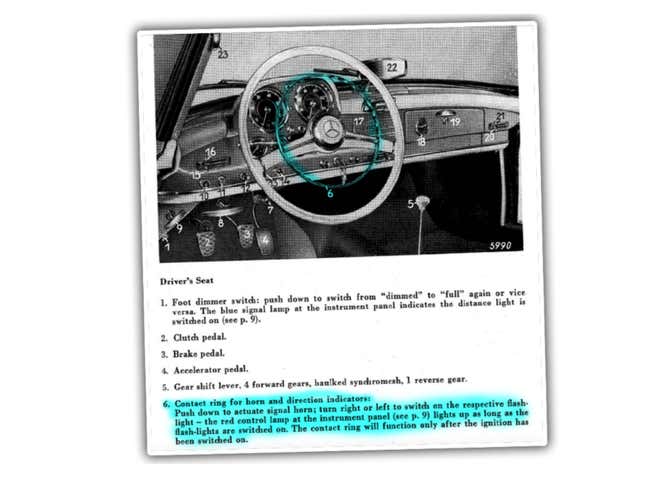
I think the horn ring approach was only used on ’50s-era Mercedes-Benzes like the 190, though some other cars had a similar approach with a little switch on the steering wheel hub. The horn ring signal switch is certainly unexpected and has lots of quirky charm.
Is this better than the stalk?
In general, these are fun, stylish approaches, but are pretty crappy to actually use. Mercedes abandoned the horn ring setup pretty quickly for a stalk, and if you ever drive one, it’s not hard to see why. Still, I’m irrationally fond of these methods.
Up-down column-mounted-pod lever
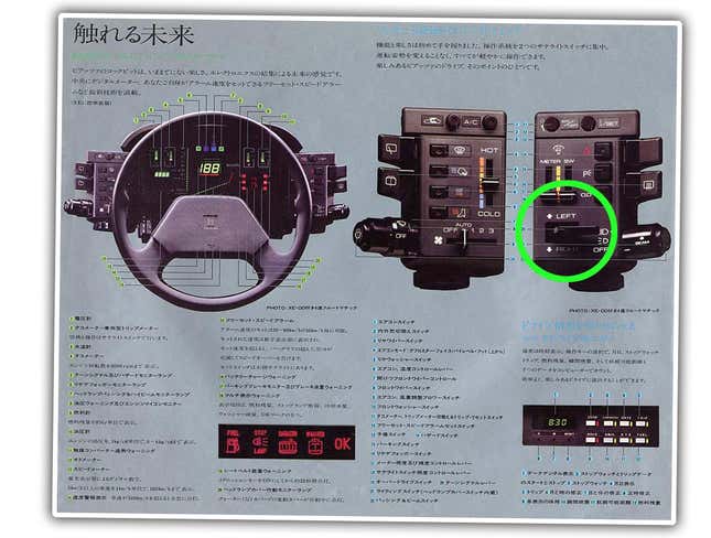
This isn’t a very common approach, but was used on a few cars, including the Isuzu Impulse that’s pictured here.
While at first this one seems terribly strange, in use it actually is almost the same as the traditional stalk. The switch is positioned at the point where the end of the stalk would normally be, so use isn’t really any different; your fingers flick it in the direction you’re turning the wheel, just like normal.
Is this better than the stalk?
Good question, me. It’s not necessarily better, but it’s not worse, either, because to the motion of your hands and fingers, it’s effectively the same. It’s just an interesting stalkless variant of the fundamental stalk design that can have a radically-different look to it. I like it!
Pod-mounted rocker switches

These seem to be the exclusive domain of Citroën, and I’ll admit I do love the look of the dashboards these types of indicator switches appear on. I’m not sure they’re actually a functional improvement, but they certainly look cool.
Citroën generally places the location and angle of these rocker switches to follow, generally, the direction of travel of the steering wheel, which is good, though the action really isn’t quite as seamless as flicking a stalk with your hands on the wheel.
These also tend not to self-cancel, something Citroën was weird about doing for a surprisingly long time, which I never fully understood.
Are these better than the stalk?
I don’t think these actually improve on the stalk for usability. They’re better than dash-mounted switches or the steering wheel mounted ones, I think. And, they certainly look cool, though I think you can achieve this same visual punch with the up-and-down lever system like on the Isuzu.
I suspect there’s more stalkless indicator solutions out there, but I think this covers most of the main variants, and seems to back up my main point: the stalk method is really, really good.
The turn signal stalk is one of those really basic things that just works, and I think it’s not just because we’re all used to it; the fundamental design makes a lot of sense.
There’s plenty of places where innovation should happen on cars, and plenty of things where the old rules should be at the very least re-considered, but I don’t think how we indicate turns is one of them.