Building a brand identity is hard. Pepsi’s been working on it for over a century, constantly changing and rebranding while Coke just stayed Coke. In the automotive world, it seemed Buick would follow that latter path forever: the same three shields, usually in three colors, have adorned the front of GM’s middle-luxury-kinda-ish brand since the 1980s. But now, it seems General Motors has decided to breathe new life into the tri-shield crest — by turning it into... hair clippers?
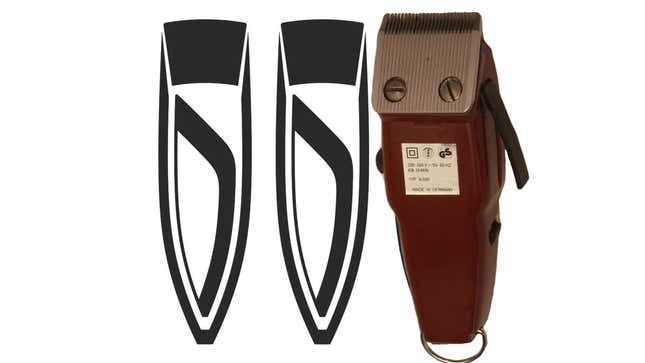
A trademark filing from last week shows a new brand identity for Buick. While the trademark drawing does look similar to the existing three shields, with the cross-bar angle and pointed bottom living on, the overall shape bears another, odder similarity. Take a look for yourself:

That’s an electric shaver. It more accurately represents something you’d find from Wahl, but I tragically left my Wahl clippers in a bathroom drawer while moving out of a college apartment so I can’t photograph them for a comparison. Trust me, the similarities are striking.
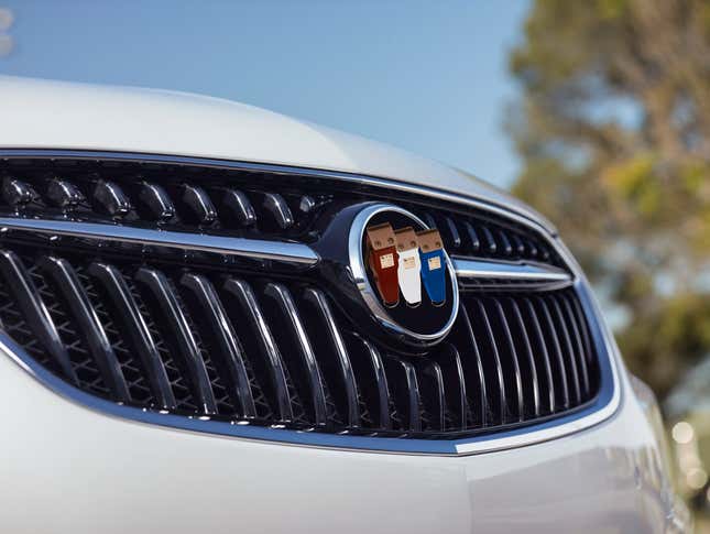
Of course, given the trademark tradition of using a single color to draw a logo against a white background, it’s tough to say exactly what the updated clipper-style logo would look like when adorning a car, dealership, or website. It may stay flat, sleek, and colorless, but modern design does seem to be ever-so-slowly shifting back towards skeumorphism — this logo actually gives Buick a chance to be ahead of the curve. Combine that with the classic tri-color badge, and we may just have the next step in Buick’s branding:

Buick, have your people talk to my people. We can make this happen.